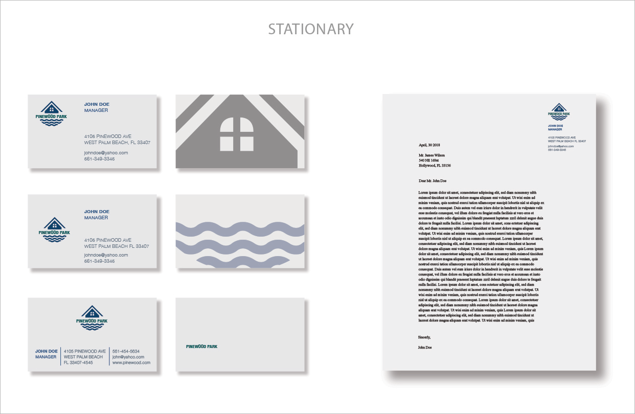
PINEWOOD LOGO AND STATIONARY
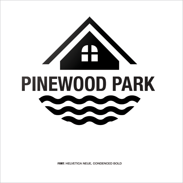
Pinewood Park is a logo that I designed for a small neighborhood situated in West Palm Beach Florida. The goal for this brand is to help unite the existing residents while attracting and drive potential tenants into the neighborhood. Since Pinewood Park is a multicultural neighborhood which consists of many different backgrounds, I wanted to build a logo mark that is easy to decipher and speaks to many different cultures. While aesthetic plays a main role in the logo mark, however, safety, reliability, and friendliness are the main components that I wanted to convey.
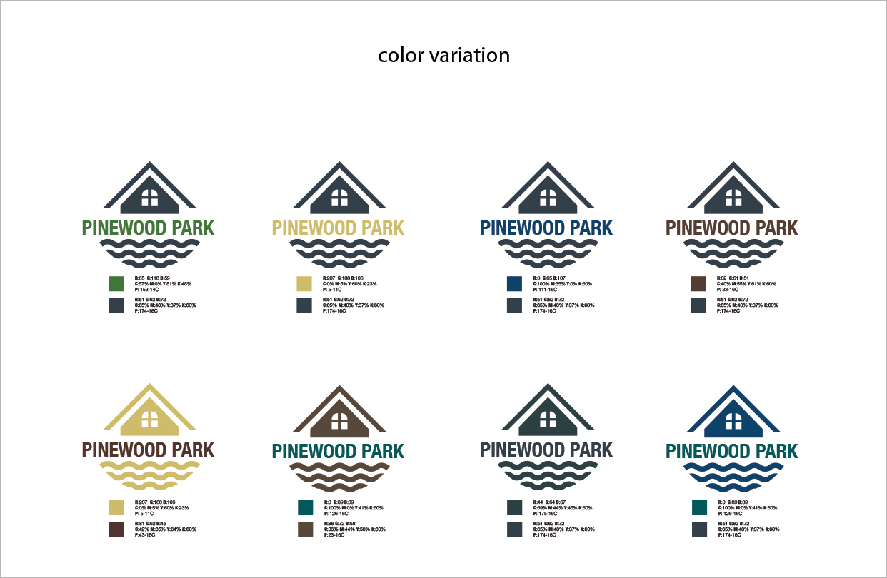
The logo mark is essentially comprised of two main parts, first is the abstract house form which signifies the beautiful historical Art Deco homes within the neighborhood. The second is the abstract wave lines which in this case represent the beach that is adjacent to the neighborhood. The color palettes for the brand varies as a way to offer a broad option for the user, however, I chose color combination that is approachable and vibrant to echo the friendliness of the brand. The primary and the main color pallet are a warm green and deep blue. The green, in this case, expresses security and it evokes a plentiful environment while providing a restful and secure feeling. The blue is to induce a calm environment while entrusting responsibility.
Before choosing the typeface, I was thinking of a font that is easy to read from a distance as the logo will be applying to signs in front of parks and other exterior platforms. I experimented with a few other fonts, but Helvetica Neue (Condense Bold) dominated the qualification as its tallness and its geometrical shape makes it easy for the eye to scan through especially during fast motion. The wordmark was strategically placed in between the logo mark not only to provides a nice contrast but also serve as a metaphorical border in between Pinewood park and the beach (the Pinewood Avenue street is what separate the beach from Pinewood Park).


